Carbob
Carbob
Carbob
UX/UI, Prototyping, Desktop Design
UX/UI, Prototyping, Desktop Design
UX/UI, Prototyping, Desktop Design
TIMELINE
TIMELINE
2025-2026; 8 weeks
2025-2026; 8 weeks
ROLE
ROLE
Product Designer
Product Designer
TEAM SIZE
TEAM SIZE
5
5
BACKGROUND
BACKGROUND
A Portuguese start-up modernizing auto repair workflows.
A Portuguese start-up modernizing auto repair workflows.
A Portuguese start-up modernizing auto repair workflows.
Carbob, a start-up based in Lisbon, is developing a SaaS platform for auto repair shops to seamlessly manage and grow their businesses. Founded in 2025, the team at Carbob recognized inefficient practices commonplace within the auto repair industry and is designing solutions to streamline all involved processes, from instant estimates to seamless scheduling and automated parts ordering.
Carbob, a start-up based in Lisbon, is developing a SaaS platform for auto repair shops to seamlessly manage and grow their businesses. Founded in 2025, the team at Carbob recognized inefficient practices commonplace within the auto repair industry and is designing solutions to streamline all involved processes, from instant estimates to seamless scheduling and automated parts ordering.
CHALLENGE
CHALLENGE
Time-consuming processes in appointments management.
Time-consuming processes in appointments management.
Time-consuming processes in appointments management.
Traditionally, auto workshops utilize disconnected processes to coordinate appointments and update statuses to clients. Appointment scheduling usually requires several rounds of back and forth verbal communication between client and mechanic before finalization, and auto repair status updates are typically confirmed with clients via telephone instead of digitally. Consequently, these tasks can be unnecessarily time-intensive for both auto repair businesses and their clients.
As of November 2025, Carbob had completed the first round of their product’s design which focused on repairs estimation. I was then brought on as a designer to assist with executing their next design phase, targeting internal scheduling and appointments management.
GOAL
GOAL
Streamlined workflows for more efficient shops.
Streamlined workflows for more efficient shops.
Streamlined workflows for more efficient shops.
By centralizing communications processes and all phases of repairs management into a singular platform, Carbob anticipates significantly reducing operational costs for auto repair businesses, especially those operating at higher-volume. My primary roles for this project were to integrate scheduling communication, status updates and repair costs into the calendar tab of the platform as well as prototype a dynamic calendar with the ability to be scalable for higher-volume auto repair shops.
By centralizing communications processes and all phases of repairs management into a singular platform, Carbob anticipates significantly reducing operational costs for auto repair businesses, especially those operating at higher-volume. My primary roles for this project were to integrate scheduling communication, status updates and repair costs into the calendar tab of the platform as well as prototype a dynamic calendar with the ability to be scalable for higher-volume auto repair shops.
01 RESEARCH
01 RESEARCH
01 RESEARCH
COMPETITIVE AUDIT
COMPETITIVE AUDIT
Understanding constraints in information-dense calendar design.
Understanding constraints in information-dense calendar design.
Understanding constraints in information-dense calendar design.
To attain a better understanding of current industry standards, I initially conducted a benchmark of direct competitors. My aim was to identify familiar UI patterns relative to appointments management and from there, ways to improve efficiency and integrate new features. Features I focused on examining included how events would stack on a calendar given overlapping timeframes, filtering systems that could benefit organization for larger-scale shops and ways to present information depending on the active calendar view.
To attain a better understanding of current industry standards, I initially conducted a benchmark of direct competitors. My aim was to identify familiar UI patterns relative to appointments management and from there, ways to improve efficiency and integrate new features. Features I focused on examining included how events would stack on a calendar given overlapping timeframes, filtering systems that could benefit organization for larger-scale shops and ways to present information depending on the active calendar view.

These are the key insights I observed:
01
Prioritizing Readability in Overlapping Events
When events overlap, the layout should stack them in a way that preserves the visibility of the most critical details—especially the appointment name and time. Even in dense scheduling scenarios, users should be able to quickly identify what matters without needing to interact or zoom in.
02
Designing Flexible Filtering Capabilities
Filtering should be comprehensive and adaptable to accommodate a wide range of business needs, preferences, and management styles.
03
Balancing Density with Clarity
Space is the biggest constraint in designing an information-dense calendar. Appointment information on a calendar view should be condensed in a way where users, at a glance, can scan and synthesize key details. Alongside a high-level overview, users should have the option to expand on details that provide more holistic context, ideally without switching screens.
02 STRATEGY
02 STRATEGY
02 STRATEGY
INFORMATION ARCHITECTURE
INFORMATION ARCHITECTURE
Building the foundation for a scalable scheduling system.
Building the foundation for a scalable scheduling system.
Building the foundation for a scalable scheduling system.
The goal of this phase was to design an interface that translates raw scheduling data into an interactive visual timeline, ultimately helping auto repair shops track and manage all of their appointments. Although Carbob eventually aims to have appointments creation available from the client’s portal, the focus for this stage targeted the auto repair shop perspective. Our team organized key features to implement in the calendar mode to optimize clarity, fluidity and refinability (click here to view expanded IA diagram, including areas beyond my scope).
The goal of this phase was to design an interface that translates raw scheduling data into an interactive visual timeline, ultimately helping auto repair shops track and manage all of their appointments. Although Carbob eventually aims to have appointments creation available from the client’s portal, the focus for this stage targeted the auto repair shop perspective. Our team organized key features to implement in the calendar mode to optimize clarity, fluidity and refinability (click here to view expanded IA diagram, including areas beyond my scope).

USER FLOW
USER FLOW
The pathway from a vehicle service inquiry to vehicle repair completion can include various obstacles, such as the level of vehicle diagnosis required and its associated charges, when a client prefers to complete payment (before/after repair, in parts, etc) and potential rounds of coordination between client and shop before settling on an appointment time. During my time on this project, Carbob was still collaborating with stakeholders on finalizing the comprehensive user flow and wanted me to focus on executing a system where shops could create appointments as a natural starting point (see orange-outlined in the user flow diagram here).
The pathway from a vehicle service inquiry to vehicle repair completion can include various obstacles, such as the level of vehicle diagnosis required and its associated charges, when a client prefers to complete payment (before/after repair, in parts, etc) and potential rounds of coordination between client and shop before settling on an appointment time. During my time on this project, Carbob was still collaborating with stakeholders on finalizing the comprehensive user flow and wanted me to focus on executing a system where shops could create appointments as a natural starting point (see orange-outlined in the user flow diagram here).
03 LOW-FIDELITY DESIGN
03 LOW-FIDELITY DESIGN
03 LOW-FIDELITY DESIGN
Optimizing hierarchy and controls for improved usability.
Optimizing hierarchy and controls for improved usability.
Optimizing hierarchy and controls for improved usability.
Keeping in mind research insights and design patterns observed from the competitive audit conducted, I began ideating different ways to incorporate and layout all the features my team had compiled previously. I went through several rounds of design revisions based on feedback from my design lead. Some topics we explored in our revision sessions included:
Keeping in mind research insights and design patterns observed from the competitive audit conducted, I began ideating different ways to incorporate and layout all the features my team had compiled previously. I went through several rounds of design revisions based on feedback from my design lead. Some topics we explored in our revision sessions included:
Information Hierarchy
Information Hierarchy
We were aiming to create a highly refinable calendar to adapt to different user needs and encountered issues with fitting a large amount of UI controls within a confined space. How could we group elements to make the page cleaner and more navigable for users?
We were aiming to create a highly refinable calendar to adapt to different user needs and encountered issues with fitting a large amount of UI controls within a confined space. How could we group elements to make the page cleaner and more navigable for users?
Combined Filtering
Combined Filtering
Based on our research, the most commonly used filters for scheduling management are time (day vs week vs month view) and by technicians. How might we combine the two to create the most usable and intuitive interface for users?
Based on our research, the most commonly used filters for scheduling management are time (day vs week vs month view) and by technicians. How might we combine the two to create the most usable and intuitive interface for users?
Design Cohesion
Design Cohesion
The calendar tab is inherently quite different visually from the workboard tab created in Carbob’s first design phase. What are ways we incorporate elements that will make the different interfaces still feel like part of the same design system?
The calendar tab is inherently quite different visually from the workboard tab created in Carbob’s first design phase. What are ways we incorporate elements that will make the different interfaces still feel like part of the same design system?

04 FINAL DESIGN
04 FINAL DESIGN
04 FINAL DESIGN
Delivering end-to-end appointments management features.
Delivering end-to-end appointments management features.
Delivering end-to-end appointments management features.
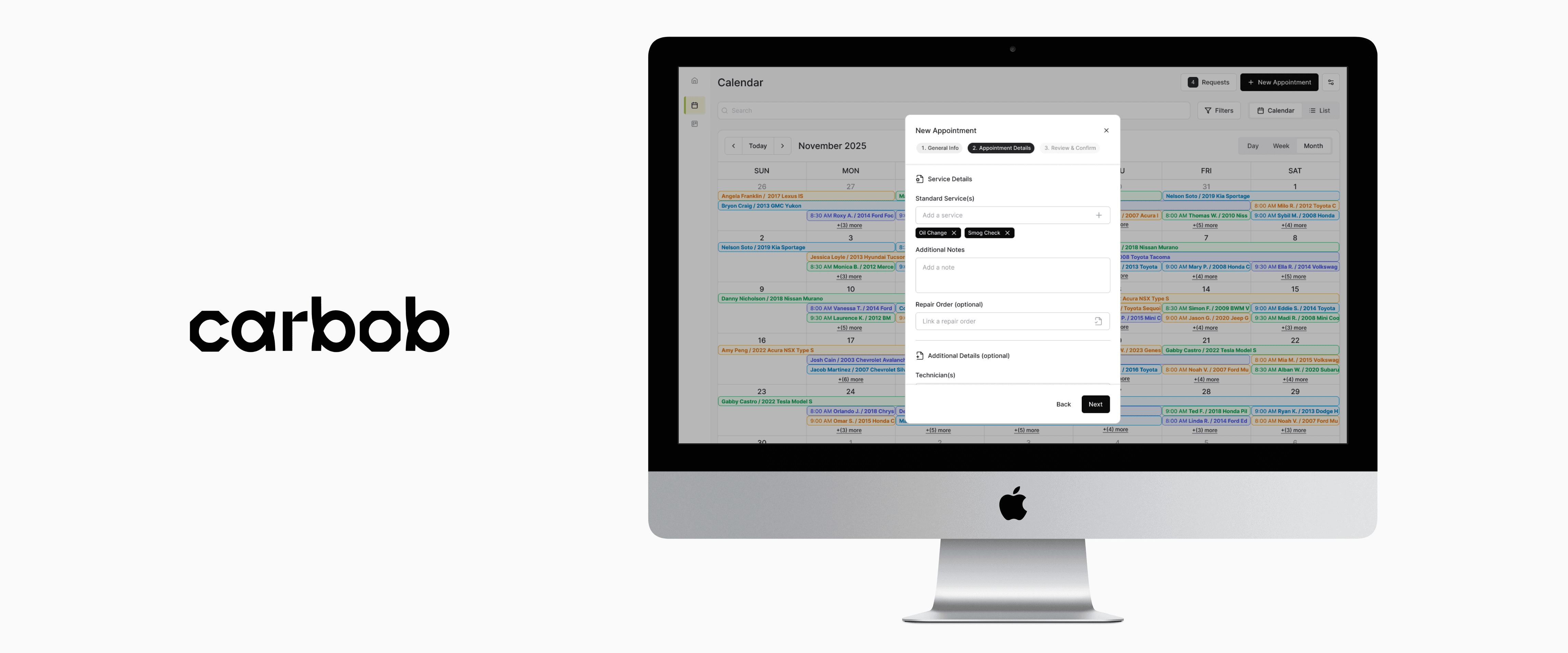
After three rounds of revisions and design team approval, I mocked-up a high-fidelity interactive prototype for the desktop experience. Final features include:
After three rounds of revisions and design team approval, I mocked-up a high-fidelity interactive prototype for the desktop experience. Final features include:
“New Appointment” Modal — includes a wizard to reduce excessive scrolling and keep form-filling more digestible.
“New Appointment” Modal — includes a wizard to reduce excessive scrolling and keep form-filling more digestible.
Advanced Filtering — offering multi-type filters allows Carbob to adapt to different business workflows, scales and priorities.
Advanced Filtering — offering multi-type filters allows Carbob to adapt to different business workflows, scales and priorities.
Advanced Filtering — offering multi-type filters allows Carbob to adapt to different business workflows, scales and priorities.
Calendar vs List View
Calendar vs List View
Time Filters (Day, Week or Month)
Time Filters (Day, Week or Month)
Facet Filters
Facet Filters
Appointment Information — keeping only the most essential information in the modal under Calendar View reduces clutter and maintains usability, especially with denser schedules. Storing any additional information in a flyover preserves an appointment’s holistic context without sacrificing visual clarity.
Appointment Information — keeping only the most essential information in the modal under Calendar View reduces clutter and maintains usability, especially with denser schedules. Storing any additional information in a flyover preserves an appointment’s holistic context without sacrificing visual clarity.
Modal
Modal
Flyover
Flyover
What's next?
What's next?
What's next?
At this time, Carbob is consulting with stakeholders and potential users on how this design is resonating and if there are any additional useful features they would like to see included before further development. Feedback could be collected via usability testing, surveys or questionnaires. Carbob can then update the prototype accordingly and test if these changes improved processes and user flows.
At this time, Carbob is consulting with stakeholders and potential users on how this design is resonating and if there are any additional useful features they would like to see included before further development. Feedback could be collected via usability testing, surveys or questionnaires. Carbob can then update the prototype accordingly and test if these changes improved processes and user flows.

